body { font-family: sans-serif; display: flex; justify-content: center; align-items: center; min-height: 100vh; background-color: #e0e0e0; /* A light grey background like in the screenshot */ margin: 0; padding: 20px; box-sizing: border-box; } .image-grid { display: grid; grid-template-columns: repeat(2, 1fr); /* Two columns */ grid-template-rows: repeat(2, 1fr); /* Two rows, adjust as needed */ gap: 20px; /* Space between images */ max-width: 900px; /* Adjust max width of the grid */ width: 100%; } .image-container { position: relative; /* Essential for absolute positioning of images inside */ width: 100%; /* Maintain aspect ratio - for example, 3:2 */ padding-bottom: 66.66%; /* (Height / Width) * 100% = (2 / 3) * 100% */ overflow: hidden; /* Hide anything outside the container */ border-radius: 8px; /* Slightly rounded corners like in the screenshot */ box-shadow: 0 4px 8px rgba(0, 0, 0, 0.2); /* Subtle shadow */ } .image-container img { position: absolute; top: 0; left: 0; width: 100%; height: 100%; object-fit: cover; /* Ensures images cover the area without distortion */ transition: opacity 0.5s ease-in-out; /* Smooth transition for the flip effect */ border-radius: 8px; /* Apply to images too to match container */ } .image-container .front-image { opacity: 1; /* Default state: front image is visible */ z-index: 2; /* Ensure front image is on top initially */ } .image-container .back-image { opacity: 0; /* Default state: back image is hidden */ z-index: 1; /* Behind the front image */ } /* Hover effect */ .image-container:hover .front-image { opacity: 0; /* On hover, hide the front image */ } .image-container:hover .back-image { opacity: 1; /* On hover, reveal the back image */ } .image-text { position: absolute; bottom: 15px; /* Adjust as needed for padding from bottom */ left: 15px; /* Adjust as needed for padding from left */ color: white; /* Text color */ font-size: 1.5em; /* Adjust font size */ font-weight: bold; text-shadow: 1px 1px 3px rgba(0, 0, 0, 0.7); /* Adds readability */ z-index: 3; /* Ensure text is always on top */ } /* Specific layout for the screenshot, if you want to mimic it precisely */ .image-grid #presence-image { grid-area: 1 / 1 / 3 / 2; /* Spans 2 rows, 1 column */ } .image-grid #people-image { grid-area: 1 / 2 / 2 / 3; /* Spans 1 row, 1 column */ } .image-grid #purpose-image { grid-area: 2 / 2 / 3 / 3; /* Spans 1 row, 1 column */ } /* Adjustments for the screenshot layout to fit content better */ @media (max-width: 768px) { .image-grid { grid-template-columns: 1fr; grid-template-rows: auto; } .image-grid #presence-image, .image-grid #people-image, .image-grid #purpose-image { grid-area: auto; /* Reset grid area for single column layout */ } }
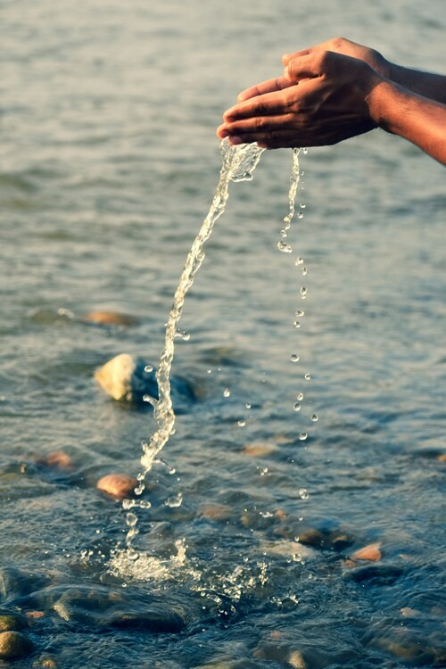
 presence
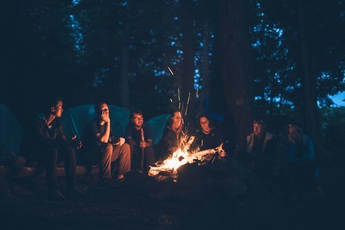
 people
 purpose